


What makes an enchanting crypto brand (Logo)
A single look burns right into your soul

Last we spoke, we went down on Ethereum’s name quite a bit. Diving into the confusion it causes, and how we have thrived in spite of it. I’ll admit I may have been a tad harsh. After all, the bustling community of Ethereum now adores its name and all that it stands for.
Thankfully, a name isn’t the only way to leave an impression. If hearing a name tickles your ear and stirs your intellect, then surely, we recall that humans are highly visual creatures as well. Enter, the logo.
And what better logo to contain the unbridled passion of cryptonites worldwide…

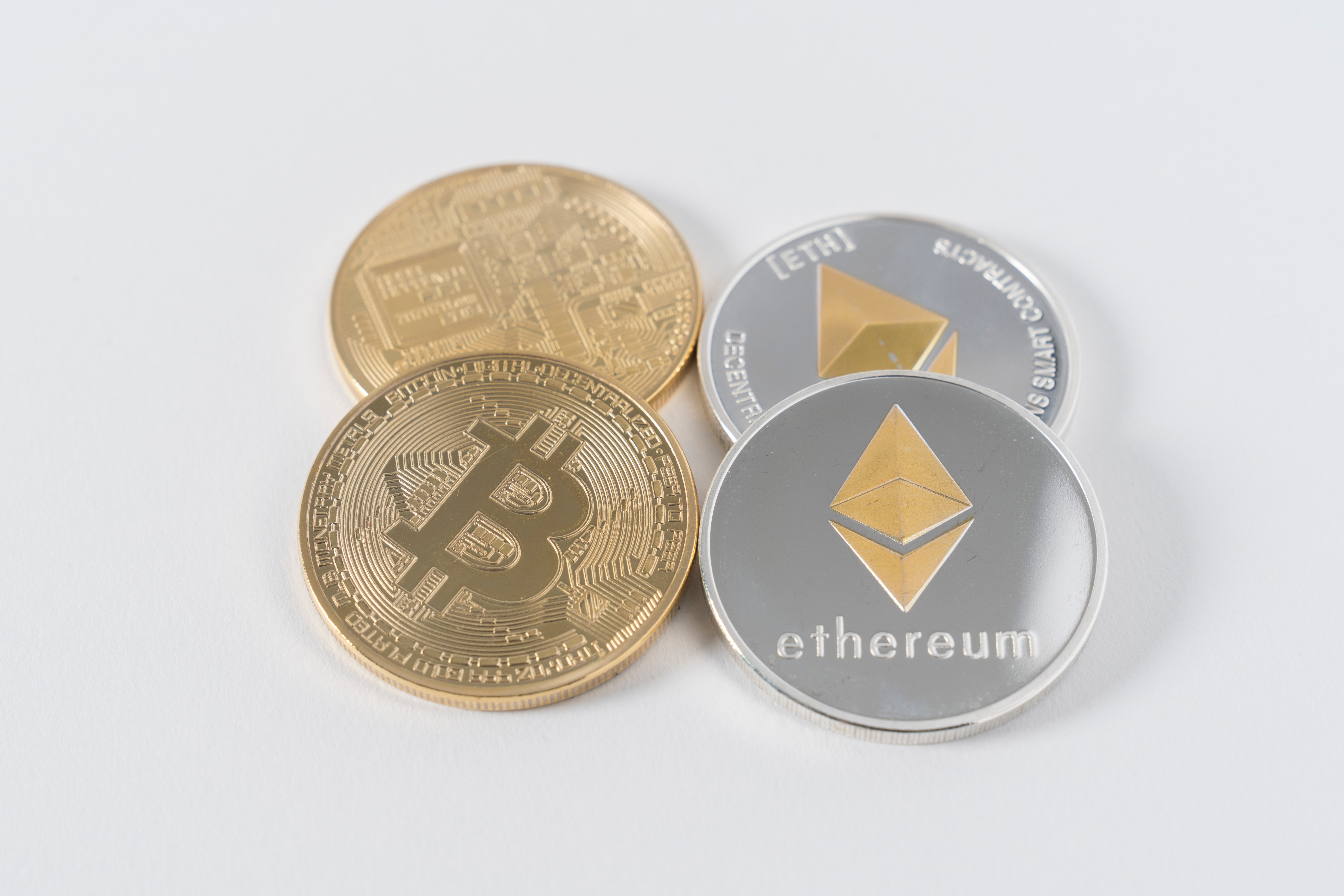
Oops, wrong one? Are you sure? I’m sure all of our hearts skipped a bit there. Don’t lie to us, you’re among friends.
Even then, a logo is still a catch-all term for logomarks, logotypes, and combination marks. In the spirit of open-source, I have used Android as an example in the linked images below.

Can you spot which type they are? Does Ethereum’s brand kit match up?
Notice the clarity of the design, consistency of the colours. For a more in-depth read, this is the article where I sourced my examples.
And this is where Bitcoin truly ticks all the boxes. Their brand logo is a like a masterful sensei, maintaining perfect balance between all 3 types, in 1 image.

It has become such an effortless and recognisable vehicle of crypto values, invoking certain emotional rides the moment we lay eyes on it. Let me explain.
In the first instalment, we’ve already talked about how the name ‘Bitcoin’ is able to succinctly convey their core purpose. Now, the logo backs it up to an even higher degree. The Bitcoin ‘B-dollar’ sign imprinted on an orange-golden circle, the ‘coin’. On one hand, it is a logomark, since it is a physical representation of a coin, without the word ‘Bitcoin’ appearing. Yet, simply looking at it helps you to read ‘Bitcoin’ in your head, simply because that’s how easily you interpret the logo and what it symbolises. Taken together, it’s a combination mark, despite not fully fitting the traditional criteria of being one. The name ‘Bitcoin’ doesn’t explicitly appear as per a combination mark, but I think we can all agree that the ‘B-dollar’ does that job well enough.
Ok- thanks for the lesson, but so what? Here’s where it gets intangible, but put simply, “a picture paints a thousand words”. Bitcoin’s logo packs a lot more meaning and emotions into the same amount of space than Ethereum does. Both our logos take up the same amount of space on CMC, yet one contains a lot more ‘thousand words’ than the other.
Here’s a thought: In the crypto branding world, who owns the ‘coin’ imagery?
Put into the real world, this means Bitcoin’s logo attracts more attention, gets recognised faster, and burns itself deeper into a viewer’s mind. Oh, and it meshes perfectly well with “digital gold”, once again. Their brand identity is now consistent across their name, slogan, and logo.
To illustrate, have a look at Ethereum’s logo on Ethereum.org brand assets. Does its meaning come across to you as quickly? Does it loudly declare its name like Bitcoin’s logo does?

But first, delving into the link above, which logo do we even look at to conduct our evaluation? There’s a full-black 2D image, a grayscale mesh logo. Look, a multi-coloured one, and don’t forget the purple. Combination marks are included too.
In what situation do we use each of them? I have no idea. The brand asset page make no mention of that too. And why do we need a new colour scheme for the Eth2 logo? Especially when the new burst of colours gives it such a different set of emotions compared to the grey one, which makes it a strange decision indeed. In branding, consistency is king. Without it, a brand will go nowhere, especially a young one.
Want people to stop asking if they need to send their Ethers somewhere for the ‘swap’ to Eth2? Stop distancing Eth2 from Eth1.X, as if they’re unrelated entities. After all, Ethereum is here and ready today.
Don’t get me wrong, I do love Ethereum’s logo. It’s mysterious, it’s complex. It attracts intellectuals like you and me, eh? Problem is, we are a tiny subset of the population. Do we want to on-board more people? Make it more accessible, friendlier to comprehend.
What exactly are we trying to comprehend about Eth’s logo, then? Ethereum logo’s meaning? Is there one? Bitcoin’s one is straightforward enough, as discussed. It helps viewers attach emotional value to the logo and thus boosts memory recall.
I also had to dig around for quite a bit on this one, and found the competition results for Ethereum’s logo back in February of 2014. This was as close to a direct source as I could get. Honestly quite a neat little piece of history, with dozens of alternative submissions. This was the winner:

Quoting the winner ‘giannidalerta’, here is the meaning of it all:
Two halves coming together. One plane is open, showing the openness of the project. (open source) another side is a mesh. The mesh can sift in or out. Sifting helps get to the essence of an premise of ethereum.
Were you satisfied reading that? I can only be honest about my own opinion, I wasn’t. More importantly, there was little to no emotional value present in that description of our logo.
That design may have been set in stone a long time ago, and that’s fine. It’s what everyone has come to know Ethereum by, but I think we can value-add on how we describe it and portray it to the world. As it stands, our logo isn’t directly representative of our use case(s), and the visuals draw a definition blank. Notice that this isn’t true for Bitcoin.
Recall: The idea of Bitcoin being ‘digital cash’ faces a lot less resistance as opposed to the concept that ‘Eth is money’. Bitcoin’s logo definitely stakes it a larger claim in that game. It may not be the most logical to think that way, but hey, it’s something people can see right in front of their eyes.
Next up, perhaps not so much of a logo, but close. On Reddit, /u/Mkkoll broached the topic of the Unicode symbol, asking, “Why was Ξ chosen as the character representing ETH? Anybody know?”
Oh dear, another deviation from the familiar, and having no links to the branding we’ve discussed so far. Meanwhile, the Unicode symbol for Bitcoin is…₿.
Consistency, consistency, consistency.
Rather amusingly, /u/CanWeTalkEth replied, “Lack of foresight.”
:: Law No. 17: The Law of Color: “A brand should use a color that is opposite of major competitor’s.”
Like I said, I do have a personal liking for Ethereum and its logo. They’ve got some things right, that’s for sure. The colour, for instance. If we take Bitcoin for our closest competitor, then the grey or purple in our logo is probably the furthest we can get from Bitcoin’s orange-gold. No one will be confusing the brand colours of those two anytime soon.
Recommendations:
Standardise the use of our precious logo. Flex out the brand assets page into a full visual kit/brand guide.
To kick things off, something like:
Ethereum logo landscape black - To be used in all formal documentation in high-profile areas such as the cover page, and for use on the website of dApps who have signed on to the #BuiltOnEthereum marketing partnership
Purple on purple background - For colour-themed pages that invokes Ethereum’s brand colours i.e. Webinar sign-up landing pages
Attach meaning to our logo, and craft a short brand story to bring the logo to life.
The bottom half is impenetrable, remains steadfast and rooted in a fast-changing world which we embrace. It contains our founding values of enabling and protecting the common man. Advanced applications, yet down-to-earth.
The top half showcases our openness as per giannidalerta the logo designer. Transparency is as much a trait as it is our strength. We are open to absorbing great ideas from all sides, while never losing sight of the upwards trajectory which the whole logo points towards.
Distance ourselves from the ‘coin’ imagery. For better or for worse, that segment has been captured by Bitcoin. I’m in favour of a ‘silver nugget’, and creating our own segment of physical representation.

Some earrings I found online. It’s a start.

In the works: Stick to your strengths and prosper